15 Stunning Exterior Color Palettes for Small Homes That Look Expensive
A small home doesn’t need a large footprint to make a lasting impression. In fact, the right exterior color palette can completely change how a home looks from the street, making it appear more refined, stylish, and valuable.
Many homeowners focus on landscaping or renovations when trying to improve curb appeal. While those upgrades can help, paint is often the quickest and most cost-effective way to create a dramatic transformation.
If you’re planning a refresh, these exterior color palettes can help your small home look polished, elegant, and surprisingly expensive.
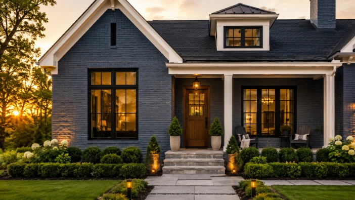
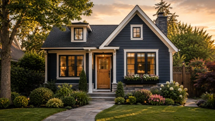
1. Classic White And Charcoal

Few combinations feel as timeless as white and charcoal.
The crisp white exterior creates brightness and openness, while charcoal accents add contrast and sophistication. This pairing works beautifully on cottages, farmhouses, and contemporary homes alike.
Best features:
- Clean and modern appearance
- Strong curb appeal
- Easy to maintain visually
- Works in almost any neighborhood
2. Soft Gray And White

Soft gray creates a calm and welcoming exterior while white trim keeps everything looking fresh.
This palette is perfect for homeowners who want a modern look without using bold or dramatic colors.
Why homeowners love it:
- Neutral and versatile
- Suitable for all architectural styles
- Complements stone and brick features
- Remains stylish for years
Adding black lighting fixtures can elevate the overall design even further.
3. Sage Green And Cream

Nature-inspired colors continue to gain popularity, and sage green is one of the most requested shades.
Paired with creamy trim, this combination creates a peaceful and inviting atmosphere.
Ideal for:
- Cottage-style homes
- Garden-focused properties
- Homes surrounded by trees
- Traditional and modern exteriors
The result feels fresh without being trendy.
4. Navy Blue And Bright White

Navy blue offers depth and elegance while bright white trim keeps the exterior balanced.
This palette creates a luxury appearance that often resembles custom-built homes.
Design ideas:
- White porch railings
- Brass hardware
- Natural wood front doors
- Stone walkways
Navy remains one of the most reliable colors for creating a premium look.
5. Beige And Warm Brown

Warm neutrals continue to be a favorite among homeowners seeking comfort and timeless appeal.
Beige siding paired with rich brown accents creates a welcoming exterior that feels grounded and sophisticated.
Benefits include:
- Warm and inviting appearance
- Excellent compatibility with landscaping
- Traditional yet stylish
- Strong resale appeal
This palette works particularly well in suburban neighborhoods.
6. Light Blue And White

Light blue creates a cheerful and airy atmosphere that instantly brightens a small home’s appearance.
White trim enhances the fresh look while adding crisp definition.
Perfect for:
- Coastal-inspired homes
- Cottage designs
- Small family houses
- Properties with colorful gardens
The combination feels relaxed yet polished.
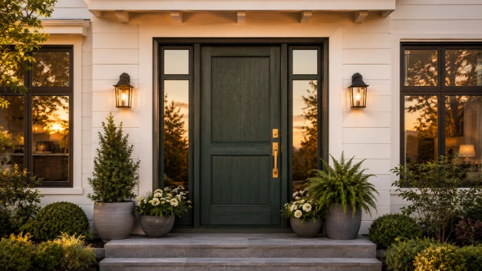
7. Charcoal And Natural Wood

Charcoal paired with natural wood creates a modern exterior that feels both sleek and welcoming.
The dark base color adds drama, while wood elements introduce warmth and texture.
Popular wood accents include:
- Front doors
- Porch beams
- Garage doors
- Window shutters
This palette is commonly used in contemporary residential designs.
8. Cream And Olive Green

Cream and olive green create a soft, earthy color scheme that feels elegant and approachable.
Unlike brighter greens, olive tones offer subtle character while maintaining sophistication.
Why it works:
- Complements natural surroundings
- Creates visual warmth
- Feels unique without being bold
- Works with stone and brick features
This pairing is especially attractive in rural and suburban settings.
9. Dusty Blue And Gray

Dusty blue introduces gentle color while gray keeps the palette balanced and modern.
The combination creates visual interest without overwhelming the home’s architecture.
Consider adding:
- White trim
- Black hardware
- Gray stone pathways
- Silver outdoor lighting
These accents help tie the overall design together.
10. Warm White And Sandstone

Warm white provides brightness, while sandstone accents add depth and character.
This palette is often used to create a luxury appearance without relying on dark colors.
Advantages include:
- Bright and welcoming look
- Excellent compatibility with landscaping
- Timeless curb appeal
- Suitable for traditional and modern homes
Natural stone elements further enhance the upscale aesthetic.
11. Black And Light Wood

Black exteriors have become increasingly popular, especially for homeowners seeking a modern architectural style.
Light wood accents prevent the design from feeling too dark.
Best applications include:
- Contemporary homes
- Minimalist designs
- Modern cottages
- Urban residences
The contrast creates a striking visual effect that feels custom and high-end.
12. Pale Yellow And White

Pale yellow adds personality while remaining soft and elegant.
Combined with white trim, this palette creates a cheerful exterior that feels welcoming year-round.
Homeowners choose this combination because it:
- Brightens small homes
- Creates charm and character
- Works well in sunny climates
- Enhances traditional architecture
It is a classic choice that continues to age beautifully.
13. Taupe And Cream

Taupe remains one of the most versatile exterior colors available.
Its blend of gray and brown undertones creates warmth and sophistication, while cream trim softens the overall appearance.
Why it’s popular:
- Neutral but not boring
- Complements many roofing colors
- Suitable for various home styles
- Timeless curb appeal
This palette offers a balanced and refined look.
14. Terracotta And Beige

Terracotta brings warmth and Mediterranean-inspired charm to a home’s exterior.
When paired with beige accents, it feels rich, inviting, and full of character.
Ideal features include:
- Clay roof tiles
- Stone pathways
- Wooden shutters
- Outdoor courtyards
This palette creates a welcoming atmosphere that feels naturally elegant.
15. Forest Green And Tan

Forest green provides depth and sophistication, while tan accents add balance and warmth.
This combination works particularly well for homes located near natural landscapes.
Benefits include:
- Strong visual character
- Excellent harmony with outdoor spaces
- Rich and timeless appearance
- Suitable for rustic and modern designs
Adding natural stone can further elevate the overall look.
How To Choose The Right Exterior Color Palette
Before selecting a color scheme, consider a few important factors:
Consider Your Roof Color
Your roof occupies a large visual area and should coordinate with the exterior paint palette.
Evaluate Natural Lighting
Colors can appear dramatically different depending on sunlight, shade, and surrounding landscaping.
Think About Your Neighborhood
While your home should reflect your style, choosing colors that complement nearby properties often creates better overall curb appeal.
Test Samples First
Paint samples can look very different on a large exterior surface than they do on a small swatch.
Viewing samples at different times of day can help prevent costly mistakes.
Simple Ways To Make Exterior Colors Look More Expensive
Even affordable paint colors can appear luxurious when paired with thoughtful details.
Try these upgrades:
- Replace outdated lighting fixtures
- Install modern house numbers
- Add fresh landscaping
- Upgrade the front door
- Use high-quality paint finishes
- Maintain clean pathways and driveways
Small improvements often create a surprisingly large impact.
Questions To Consider Before Painting
- Do you want your home to stand out or blend in?
- Which colors complement your landscaping?
- Are you choosing a timeless palette or following a current trend?
Answering these questions can help narrow down your options and ensure long-term satisfaction.
Conclusion: Small Colors, Big Impact
A beautiful exterior doesn’t depend on the size of your home. The right color palette can make a compact property feel more elegant, inviting, and visually impressive.
Whether you prefer the timeless contrast of white and charcoal, the natural charm of sage green and cream, or the modern appeal of black and wood, thoughtful color choices can dramatically improve curb appeal. Combined with simple upgrades and quality finishes, these palettes help create a home that feels polished, welcoming, and far more expensive than its actual renovation cost.