16 Colorful Kitchen Backsplash Ideas to Brighten Your Space
A backsplash may cover only a portion of your kitchen walls, but the right color can completely change how the entire room feels.
A plain white kitchen can suddenly feel cheerful with blue tiles. Warm terracotta can soften sleek cabinetry, while a multicolored mosaic can turn an otherwise overlooked wall into the room’s most memorable feature.
The challenge is knowing how much color to introduce. Too little may disappear among cabinets and countertops, while too many competing shades can make a busy kitchen feel even busier.
These colorful kitchen backsplash ideas cover everything from quiet mint glass and pastel blue chevrons to saturated reds, saffron yellows, and dramatic orange-and-charcoal combinations. More importantly, each idea includes practical ways to coordinate the backsplash with cabinetry, counters, hardware, and the overall mood of your kitchen.
Your Guide to Choosing Colorful Kitchen Backsplash Ideas
Before choosing a tile because you love its color, look at the permanent finishes already in your kitchen.
Cabinet color, countertops, flooring, appliances, and natural light all influence how backsplash colors appear. A rich navy tile, for example, may look sophisticated in a sunny kitchen but considerably darker in a small room with limited daylight.
A useful approach is to identify one existing color or undertone that the backsplash can relate to. Warm cream counters can work beautifully with terracotta, coral, saffron, and muted red. Cooler white or gray surfaces often pair naturally with blues, greens, lavender, and teal.
Also consider where the visual activity should happen. If your countertop contains dramatic veining, a simpler colorful backsplash may work better than a complicated pattern. With a quiet solid countertop, however, there is more room to experiment.
Before ordering a full quantity, place several tile samples against the actual wall and view them throughout the day. Morning sunlight, overhead lighting, and warm evening bulbs can make the same tile look surprisingly different.
1.Imagine a Rainbow Mosaic for Eclectic Homes

A rainbow mosaic is one of the most expressive ways to introduce color into a kitchen.
Instead of relying on one dominant shade, small mosaic pieces can combine blue, turquoise, yellow, coral, green, and other complementary colors. The result feels energetic without requiring colorful cabinetry or appliances.
The secret is giving all those colors somewhere quiet to rest.
Pair a lively mosaic with white, cream, light gray, or natural wood cabinets. A simple countertop also prevents the kitchen from becoming visually overwhelming.
You don’t necessarily need to cover every wall. Installing the mosaic behind the range or sink can create a concentrated feature while keeping surrounding areas restrained.
Practical tip: Choose two or three shades from the mosaic and repeat them subtly through kitchen accessories, stools, ceramics, or textiles. This makes the backsplash feel connected to the rest of the room rather than randomly colorful.
2.Picture a Deep Blue Subway Tile for Modern Kitchens
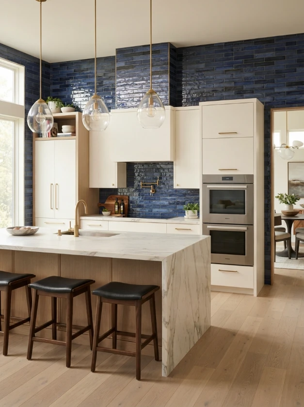
Subway tile is familiar, but a saturated blue finish gives this classic format a much stronger personality.
Deep cobalt, ocean blue, indigo, or rich navy can create an impressive backdrop for white or light wood cabinetry. The simple rectangular shape keeps the installation orderly while color provides the visual impact.
A glossy finish is particularly effective when you want to reflect light around the kitchen. For something quieter, consider a handmade or matte tile with slight variations in tone.
Deep blue also works beautifully beside metallic details.
Try pairing it with brushed brass for warmth, polished nickel for a crisp appearance, or matte black hardware for stronger contrast.
If your kitchen is small, sample darker blues carefully before committing to the entire wall. Good natural or layered artificial lighting can help maintain an open feeling.
3.Try a Vibrant Green Herringbone for Nature Lovers
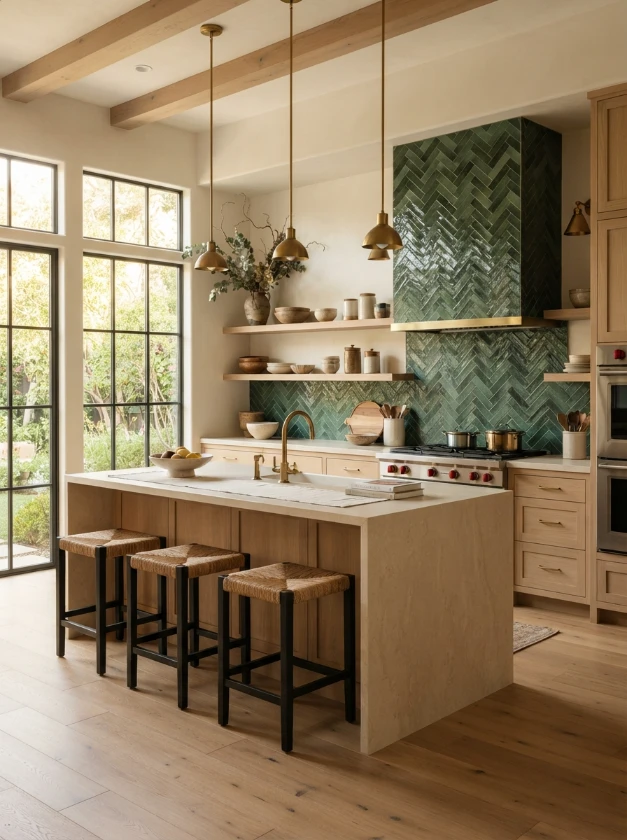
Green has a natural relationship with wood, stone, and other earthy materials, making it especially useful in kitchens inspired by the outdoors.
Emerald, forest, leaf, or rich olive tiles arranged in a herringbone pattern add both color and movement.
Because the pattern itself creates visual activity, you can keep surrounding finishes relatively simple. White oak cabinetry, creamy counters, and understated hardware allow green tile to become the focal point.
Want something less dramatic?
Choose a slightly muted green rather than a jewel tone. You will still get personality without making the backsplash dominate every other feature.
Design tip: Herringbone requires more cuts and planning than a straightforward stacked installation. Discuss layout, starting points, and waste allowance with your installer before ordering material.
4.Consider Warm Terracotta Tile for Rustic Charm
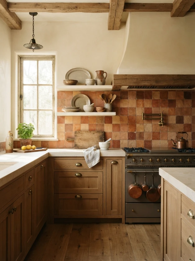
Not every colorful backsplash needs a bright primary color.
Terracotta introduces burnt orange, clay, rust, and earthy red tones that can warm up the entire kitchen while still feeling grounded.
Its natural character is particularly attractive beside wood cabinets, stone counters, aged brass, and creamy painted finishes.
You can use square terracotta tiles for a relaxed traditional look or choose elongated shapes for something more contemporary.
Natural terracotta can vary considerably from tile to tile, and that variation is part of its charm. However, genuine terracotta is porous and may require appropriate sealing and maintenance.
Ask the manufacturer or installer about recommended care, especially in areas exposed to cooking splashes.
5.Anchor the Kitchen with a Yellow Geometric Pattern
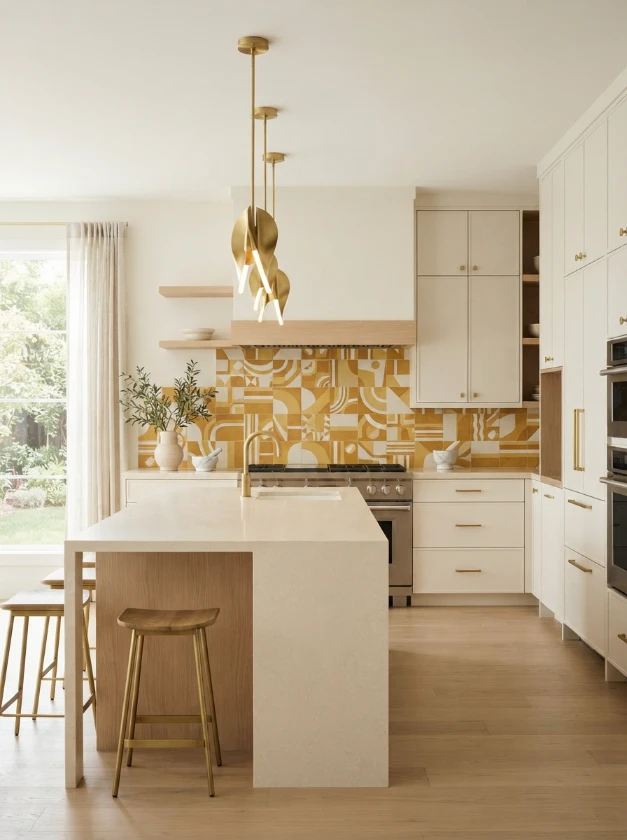
Yellow can make a kitchen feel brighter before you switch on a single light.
Rather than using a completely solid yellow wall, consider patterned tiles that combine mustard, ochre, butter yellow, or golden tones with cream or white.
Geometric designs introduce another layer of personality and work particularly well with straightforward cabinetry.
For a contemporary kitchen, combine a yellow pattern with flat-panel white or warm gray cabinets. Natural wood can soften the geometry and make the overall space feel more welcoming.
If a full backsplash seems too strong, use patterned yellow tiles behind the range and coordinate them with simpler surrounding tiles.
6.Layer a Pink and Gold Mosaic for Glamorous Style
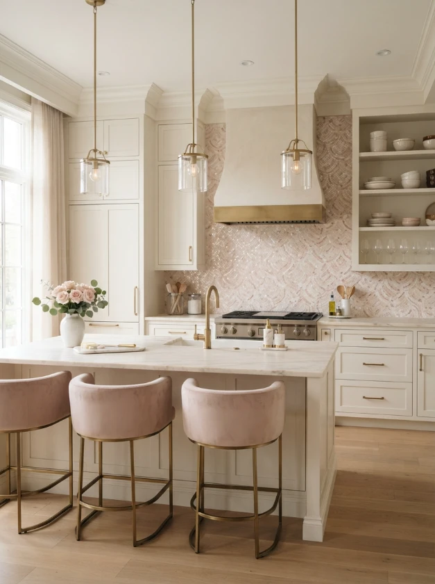
Pink can be surprisingly sophisticated when used with the right materials.
Dusty rose, blush, muted salmon, or soft pink mosaic tiles paired with warm metallic details can give a kitchen an elegant, polished appearance.
Gold doesn’t necessarily need to be part of the actual tile. Brass faucets, cabinet pulls, pendant lights, or shelf brackets can provide the metallic element.
This pairing works particularly well with cream, ivory, warm white, or pale taupe cabinetry.
Avoid adding too many decorative finishes at once. When the backsplash already contains shimmer, texture, or multiple tones, quieter countertops and cabinet fronts create better balance.
7.Build Character with a Bold Red Brick Backsplash

Red brick brings color through material rather than through a polished decorative surface.
Its irregular texture and warm red-brown tones suit industrial kitchens particularly well, especially when combined with black metal, dark wood, stainless steel, or concrete-inspired finishes.
Traditional brick can be thick and heavy, so thin brick veneer may be a more practical backsplash option in some kitchens.
You can also choose reclaimed-looking brick for additional variation in color and texture.
Because kitchens produce grease, moisture, and food splashes, make sure the selected brick or veneer is appropriate for backsplash use and follow the manufacturer’s recommendations regarding sealing and cleaning.
8.Bring in Pastel Blue Chevron for Soft Elegance
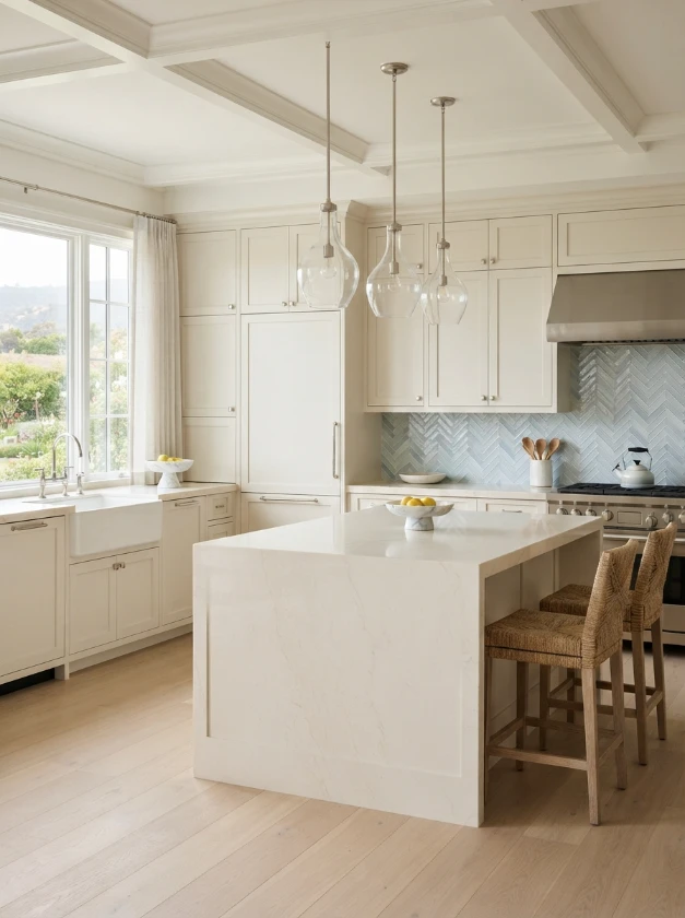
Pastel blue offers color without the intensity of navy or cobalt.
Arrange pale blue tiles in a chevron pattern and the backsplash gains movement while maintaining a light, airy appearance.
This combination is especially attractive with white cabinetry, pale oak, brushed nickel, soft gray stone, and warm white countertops.
For a slightly more relaxed kitchen, consider tiles with subtle variations between blue, gray, and powdery aqua.
Keep grout relatively understated if you want the chevron shape to feel gentle. Strongly contrasting grout will emphasize every line and make the pattern considerably more graphic.
9.Make a Statement with Purple and Teal
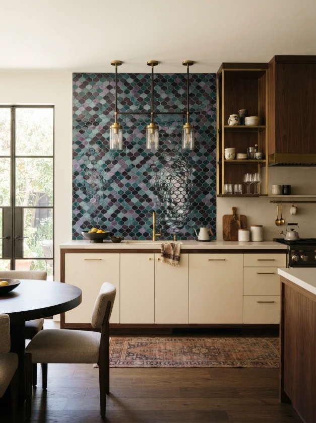
Purple and teal are an unexpected pairing, which is precisely why they can create such an interesting backsplash.
Rich plum, aubergine, turquoise, and peacock teal can work together in mosaics, patterned tiles, or carefully planned color blocks.
Since both colors have strong personalities, neutral surroundings are usually the safest choice.
Warm white cabinetry, simple counters, and minimal hardware allow the backsplash to take center stage.
One color can also dominate while the other appears only as an accent. For example, mostly teal tile with occasional purple pieces often feels more controlled than an equal mix of both.
10.Add Warmth with Coral Subway Tile
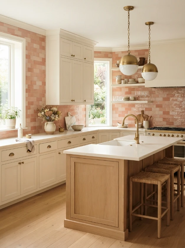
Coral sits somewhere between pink and orange, giving a kitchen warmth without the heaviness of dark red.
A coral subway backsplash can look particularly fresh alongside warm white cabinetry, pale wood, cream stone, and brass hardware.
The tile finish makes a noticeable difference.
Glossy coral feels brighter and more playful, while a matte or handmade surface can appear softer and more organic.
If you’re hesitant about committing to a saturated coral wall, look for muted clay-coral or peachy terracotta shades. They offer the same warm effect in a more understated way.
11.Use a Navy and White Checkerboard for Classic Appeal

Checkerboard patterns aren’t limited to kitchen floors.
A navy-and-white backsplash creates a graphic focal point while using two colors that are relatively easy to coordinate with other kitchen finishes.
Crisp white and dark navy feel bold and tailored. An off-white paired with softer blue creates a gentler interpretation.
Keep the rest of the room fairly simple if the checkerboard covers a large area. Shaker cabinets, uncomplicated counters, and restrained hardware can complement the pattern without competing with it.
For a smaller dose, create a checkerboard panel behind the stove and use a quieter coordinating tile elsewhere.
12.Add Texture with Multi-Color Penny Tile
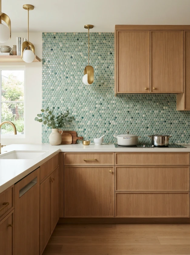
Tiny round penny tiles bring texture even before color enters the equation.
Mix several shades and the backsplash becomes much more dynamic.
You might combine sea green, blue, turquoise, and white for a coastal influence, or use terracotta, cream, ochre, and brown for something warmer.
Because penny tile contains many grout joints, grout color has a significant impact on the finished appearance.
A close tonal grout can visually blend the individual pieces, while contrasting grout emphasizes every circle.
There is also a practical consideration: more grout means more grout lines to maintain. Choose kitchen-appropriate materials and discuss suitable grout and sealing options with your installer.
13.Define the Space with Saffron Yellow Moroccan Tile
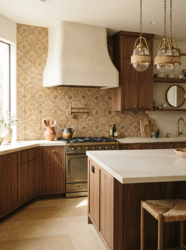
Saffron yellow brings warmth and personality to decorative Moroccan-inspired tile.
Depending on the design, it can be combined with white, cream, blue, green, or earthy brown details.
These tiles work especially well when the rest of the kitchen is relatively restrained. Natural wood cabinets and creamy stone surfaces provide a calm background for the detailed pattern.
You don’t need a huge installation to make an impact.
A decorative section between the countertop and open shelves can provide enough pattern to establish character without overwhelming the room.
Allow the tile design to be the decorative feature rather than surrounding it with numerous competing accessories.
14.Introduce Mint Green Glass Tile for Freshness

Mint green is ideal when you want the kitchen to feel colorful but still light.
Glass tiles enhance this effect because their reflective surfaces can bounce light around the backsplash area.
Mint pairs naturally with white, cream, pale gray, and blonde wood. It can also soften darker cabinetry when used thoughtfully.
For a contemporary interpretation, consider elongated glass tiles installed vertically or in a clean stacked arrangement.
Before selecting glass, inspect physical samples. Transparency, backing material, grout, and lighting can influence the final color once the tile is installed.
15.Create Serenity with Lavender Herringbone Tile
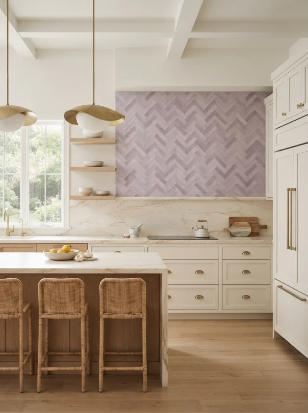
Lavender isn’t one of the most common kitchen colors, and that can make it particularly appealing when you want something distinctive.
Soft lavender, dusty lilac, or muted mauve tiles can create a gentle backsplash without looking childish.
A herringbone arrangement gives these quieter shades additional structure.
Pair lavender with warm white cabinets, light stone counters, pale oak, or subtle brass details for an elegant palette.
Undertones matter here. Some lavender tiles lean pink, while others contain more blue or gray. Place samples beside your cabinets and countertop before making the final decision.
16.Ground the Room with Charcoal and Orange
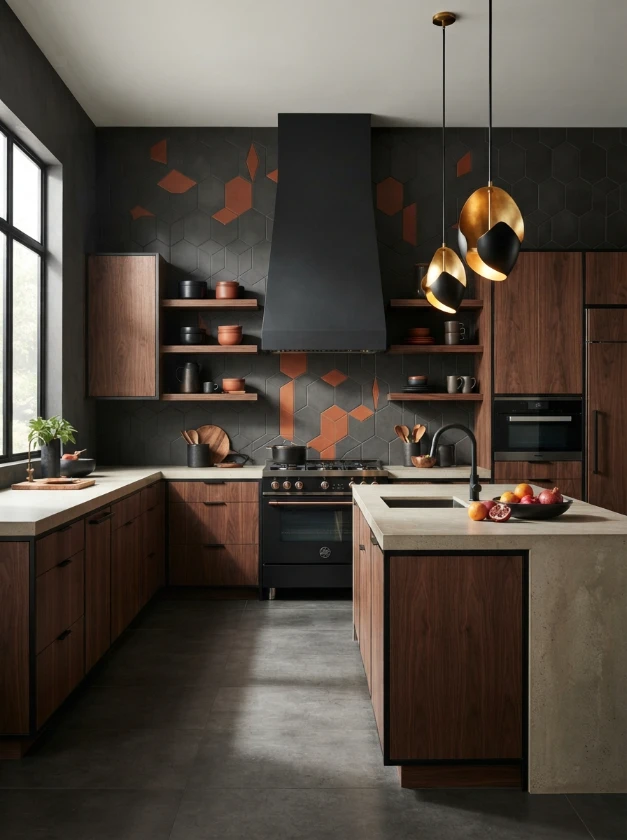
If subtle isn’t your goal, charcoal and orange create powerful contrast.
Charcoal provides a dark neutral foundation while burnt orange, rust, or vivid orange adds energy.
There are several ways to use the combination without making it chaotic. You could select patterned tiles containing both shades, create an orange feature section against charcoal surroundings, or use predominantly charcoal tile with smaller orange accents.
Black hardware, dark wood, and concrete-inspired counters can reinforce an industrial look. Warm wood cabinetry can make the same palette feel less severe.
The key is proportion.
Let one shade dominate and use the second as an accent. A carefully controlled ratio usually looks more sophisticated than an equal split between two strong colors.
Frequently Asked Questions
What backsplash color makes a kitchen look brighter?
Light-reflective colors such as pale blue, mint, soft yellow, cream, and some lighter greens can contribute to a brighter visual effect, particularly when the tile has a glossy finish.
However, backsplash color alone cannot compensate for poor lighting. Cabinet colors, window placement, countertop reflectivity, and artificial lighting all influence how bright the kitchen feels.
Should a colorful backsplash match the countertops?
It doesn’t need to match exactly.
A more natural approach is to find a relationship between them. For example, a backsplash can repeat a subtle undertone or veining color from the countertop while still introducing a noticeably different main shade.
Can a small kitchen have a colorful backsplash?
Absolutely. Color doesn’t automatically make a small kitchen look cramped.
The amount, saturation, pattern scale, and surrounding finishes matter more. Light blue or mint can be particularly easy to use, but even dark blue or emerald can work beautifully when balanced with good lighting and lighter surfaces.
Should the backsplash be lighter or darker than the cabinets?
Either can work.
Dark tile against light cabinetry creates obvious contrast, while lighter tile can brighten dark cabinets. A similar tonal value produces a quieter, more cohesive result.
Rather than following a fixed rule, decide whether you want the backsplash to blend into the kitchen or become a focal point.
How many colors should a kitchen backsplash have?
There is no strict limit, but restraint usually makes coordination easier.
For patterned or mosaic designs, choose one dominant color and a few supporting shades. Then allow cabinetry, countertops, and flooring to provide visual breathing room.
Are colorful kitchen backsplashes likely to go out of style?
Individual colors and patterns move in and out of popularity, but choosing solely according to trends isn’t necessary.
A backsplash that works with your home’s architecture, permanent finishes, and personal taste can remain appealing long after a particular color stops appearing everywhere online.
If resale flexibility matters, consider putting very bold patterns in a smaller feature area rather than covering every available wall.
Conclusion
The best colorful kitchen backsplash ideas don’t simply add bright tile to an empty wall. They create a deliberate relationship between color, cabinetry, countertops, lighting, hardware, and the personality of the home.
You might prefer the richness of deep blue subway tile, the earthy warmth of terracotta, the softness of lavender, or the playful character of a rainbow mosaic. There isn’t one color that works for every kitchen.
Start with the finishes you already have, decide how prominent you want the backsplash to be, and bring actual samples into the room before ordering.
A backsplash is much easier to love when the color looks just as good beside your cabinets on an ordinary afternoon as it did in the showroom.