Stunning Paint Color for Open Concept Kitchen and Living Room Ideas
Choosing one paint color is hard enough. Choosing colors for a kitchen and living room that flow directly into each other can feel even more complicated.
In an open-concept home, you can often see the kitchen, dining area, and living room at the same time. That means a wall color that looks beautiful beside your sofa may feel completely different next to kitchen cabinets, countertops, flooring, or a backsplash.
The good news is that an open floor plan does not require every wall to be exactly the same color. The goal is simply to create a palette that feels connected.
These stunning paint color for open concept kitchen and living room ideas range from quiet neutrals to richer statement shades, giving you options for bright modern interiors, cozy family spaces, earthy homes, and more dramatic designs.
How to Choose the Perfect Paint Color for Open Concept Kitchen and Living Room
Before comparing paint swatches, look at the permanent features already in the space.
Cabinets, countertops, flooring, stone, tile, and large furniture pieces usually cost much more to replace than paint. Your wall color should therefore work with these existing finishes rather than fight against them.
Start by identifying whether the dominant finishes lean warm, cool, or relatively neutral.
For example, honey-toned wood floors, cream countertops, and warm oak cabinets generally pair well with warm whites, greige, beige, taupe, and earthy greens. Gray stone, cool white cabinetry, black details, and blue-gray upholstery may work better with cooler whites, blues, charcoal, or muted greens.
Natural light matters too.
A sunny room can make colors appear lighter and sometimes warmer, while a darker room may make the same shade look heavier. Artificial lighting also changes how paint appears after sunset.
Before committing to a color:
- Paint large sample areas rather than relying on a tiny swatch.
- Check each sample in the kitchen and living room.
- View it in morning, afternoon, and evening light.
- Compare it against cabinets, countertops, flooring, and upholstery.
- Look at the color under your usual lamps and ceiling lights.
- Test adjacent colors together if you plan to create different zones.
Do you want the open space to feel bright and airy, warm and comfortable, or bold and sophisticated?
Answering that question first can make the rest of the selection process much easier.
1. Soft Greige for Comfortable Warmth
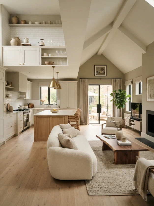
Greige sits somewhere between gray and beige, making it one of the most adaptable choices for an open-concept interior.
It provides more warmth than a cool gray while remaining quieter and less yellow than many traditional beige shades.
A soft greige can work particularly well when the kitchen contains white or cream cabinetry and the living area includes warm wood, linen upholstery, or natural textures.
For a cohesive combination, try:
Soft greige walls + warm white cabinets + light oak + cream upholstery + matte black accents
The result feels contemporary without becoming cold.
Pay close attention to undertones when choosing greige. Some shades lean noticeably purple, green, or pink in certain lighting, so testing a large sample is important.
2. Sage Green for a Nature-Inspired Interior
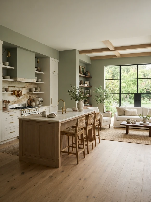
Sage green offers color without demanding too much attention.
Its muted, slightly gray character allows it to behave almost like a neutral, particularly when paired with natural materials.
Use sage alongside white oak, walnut, cream fabrics, stone countertops, woven baskets, and off-white cabinetry for a relaxed organic appearance.
If painting the entire open space green feels like too much, use sage in one defined section and select a warm off-white for adjoining walls.
Repeating green through cushions, plants, artwork, or kitchen accessories can then connect both areas.
Practical tip: Compare your chosen sage against the cabinetry. A green with a strong yellow undertone can look very different beside a crisp cool-white cabinet than beside cream or natural wood.
3. Warm White to Maximize Light

White is not as simple as it first appears.
Warm whites contain subtle cream, beige, or yellow undertones that soften a large open-plan room and can make it feel more inviting.
They are especially useful when you want the kitchen and living room to share one continuous wall color.
Warm white creates a flexible backdrop for wood cabinetry, stone surfaces, colorful artwork, rugs, and changing seasonal décor.
Rather than allowing a white room to become visually flat, introduce contrast through texture.
Think:
- Oak or walnut furniture
- Linen curtains
- Woven rugs
- Stone or ceramic accessories
- Black or aged-brass hardware
- Textured cushions and throws
The variation in materials gives the room dimension even when the overall palette remains restrained.
4. Deep Navy for Dramatic Contrast
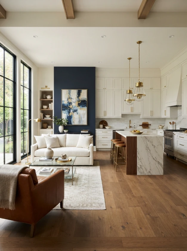
Not every open-concept interior needs to be pale.
Deep navy can create an elegant focal area, particularly in a spacious room with plenty of natural or artificial light.
Instead of painting every wall navy, consider using it strategically on a prominent living-room wall, around built-in shelving, or in a clearly defined section of the open floor plan.
Then repeat small navy details elsewhere to create continuity.
For example:
Deep navy accent wall + warm white main walls + walnut furniture + brass details + ivory upholstery
Navy also works beautifully with white kitchen cabinetry because the contrast gives both colors greater definition.
In a smaller or poorly lit interior, however, large amounts of navy can make the space feel visually heavier. Sampling is especially important with dark colors.
5. Clay Terracotta for an Earthy Tone

Clay and muted terracotta bring warmth into an open living space without relying on traditional beige.
These colors are inspired by fired clay and earthy mineral tones, making them natural partners for wood, stone, leather, linen, and handmade ceramics.
A subdued terracotta wall can be particularly attractive in the dining or living portion of an open-plan layout.
Keep nearby colors quieter so the earthy shade has room to stand out.
Try pairing terracotta with:
- Cream
- Warm white
- Natural oak
- Walnut
- Olive green
- Aged brass
- Warm gray
Avoid combining too many strong warm colors in one uninterrupted room. A few carefully repeated terracotta accents are often more effective than covering every surface.
6. Pale Blue for a Calm, Airy Feeling

Pale blue can give an open-concept kitchen and living room a light, peaceful quality.
It works particularly well in interiors with white cabinetry, pale wood, soft gray, and plenty of daylight.
For a more sophisticated appearance, look for a muted blue rather than a highly saturated pastel.
You can then warm the room with natural wood, beige textiles, rattan, or brass so the space does not feel overly cool.
A combination such as pale blue walls, white cabinets, oak flooring, and oatmeal-colored seating creates a balanced palette that feels fresh but still comfortable.
7. Charcoal Gray for a Modern Edge

Charcoal creates stronger architectural definition than pale gray.
It can be an effective choice when you want to visually anchor one part of a large open floor plan.
A charcoal feature wall behind a sofa, fireplace, television unit, or built-in storage can help establish the living zone without constructing a physical divider.
The kitchen can remain lighter with warm white or soft gray walls.
Charcoal looks particularly polished beside:
Light oak + warm white + black metal + cognac leather + cream textiles
Because dark gray can have blue, green, brown, or purple undertones, always compare samples directly with the fixed materials in your room.
8. Blush Pink for Soft Elegance
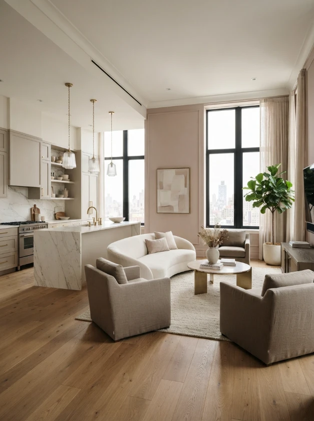
Blush pink can be surprisingly sophisticated when the shade is muted.
Instead of a sugary pastel, look for dusty, beige-based, or slightly earthy pinks.
These shades can complement warm wood, ivory, taupe, marble, brass, and soft gray.
For an open kitchen and living room, blush is often most effective as a supporting color rather than the only shade in the entire space.
You might use a warm neutral throughout the kitchen and circulation areas, then introduce blush on a living-room wall.
Repeating the shade through artwork or a few accessories helps connect the two spaces without making everything match.
9. Buttercream Yellow for a Cheerful Vibe
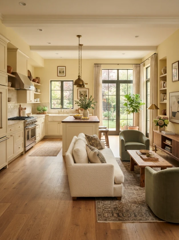
For homeowners who prefer warm and welcoming interiors, a restrained buttercream yellow can add gentle brightness.
The key word is restrained.
Very strong yellow may dominate a large open room, while a creamy, softened version can reflect warmth without becoming overwhelming.
Buttercream can pair nicely with cream cabinets, warm white trim, medium-tone wood, muted green, and natural fabrics.
It can also suit homes with traditional or cottage-inspired architectural details.
Before using yellow throughout a bright south- or west-facing space, test it during the sunniest part of the day. Strong warm light may intensify its yellow undertones.
10. Taupe for Understated Luxury
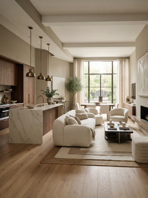
Taupe is a sophisticated option when beige feels too warm and gray feels too cool.
Depending on the specific shade, taupe may contain gray, brown, violet, or subtle rosy undertones.
In an open-concept room, it creates a calm background for layered neutrals and high-quality materials.
Consider:
Taupe walls + creamy stone + walnut cabinetry + ivory sofa + aged brass accents
This combination can feel refined without depending on dramatic colors.
Taupe also works well when the kitchen and living room contain several different textures. It quietly connects stone, wood, fabric, and metal rather than competing with them.
11. Mint Green for a Touch of Retro Charm

Mint green can bring personality to an open-plan interior, but choosing the right version matters.
Instead of a bright candy-colored mint, consider a softened or slightly gray-green variation for a more livable result.
Mint can work beautifully with white, pale oak, warm wood, cream, and subtle vintage-inspired details.
It may be particularly appealing in a cottage, mid-century-inspired, or retro kitchen.
If you want only a hint of mint, use it in the kitchen and carry a few related green details into the living area through cushions, artwork, ceramics, or plants.
This creates a connection without turning the entire open space into one color.
12. Warm Beige for Classic Comfort
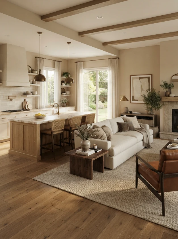
Warm beige has returned to many contemporary interiors because it pairs naturally with the warmer woods, creamy stones, and earthy textiles popular in current home design.
It can make a large open-plan space feel more comfortable than stark white while still providing a quiet background.
Beige is particularly useful when your room already contains several visual elements, such as patterned stone, prominent wood grain, colorful rugs, or statement furniture.
For a layered neutral scheme, combine:
- Warm beige walls
- Cream upholstery
- Medium-tone oak
- Brown or cognac accents
- Off-white curtains
- Aged brass or bronze hardware
The variation in tone prevents a neutral room from looking monotonous.
13. Dusty Lavender for Unique Flair
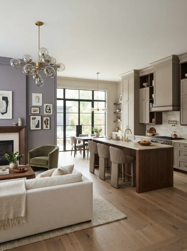
Dusty lavender is an unexpected choice for an open-concept home, which is exactly what can make it interesting.
Muted lavender contains enough gray to feel calmer and more sophisticated than a bright purple.
It can complement taupe, warm gray, soft white, walnut, and muted green.
Consider using lavender in the living area while keeping the kitchen more neutral. A few subtle purple-gray details can then be repeated through artwork, flowers, or textiles.
Would you normally think of lavender for a kitchen and living room?
Probably not—and for a homeowner who wants something different from the usual beige-and-white palette, that may be part of its appeal.
14. Pure White for Minimalist Appeal

A cleaner white can suit modern interiors with simple architectural lines, streamlined cabinetry, and strong contrasting details.
It provides a crisp backdrop for black fixtures, modern furniture, natural wood, and sculptural décor.
However, a white that looks perfect in one house can appear blue, gray, or overly stark in another because surrounding light and finishes affect how we perceive color.
A minimalist white interior also needs thoughtful layering.
Rather than filling the room with decorative objects, create interest through materials:
White walls + oak cabinetry + stone countertops + textured cream sofa + black accents
This keeps the open layout visually clean while avoiding a sterile appearance.
Creating a Cohesive Color Flow Between the Kitchen and Living Room
Choosing a beautiful paint shade is only half of the job. The kitchen and living room should also feel visually related.
One of the easiest methods is to select a dominant neutral for most walls and introduce one or two supporting colors.
For example, imagine an open room with warm white as the main wall color. Sage might appear on a feature wall, while natural oak and muted brass provide repeated material accents.
Another approach is to use variations from the same color family.
A lighter neutral can work in the kitchen while a slightly richer version defines the living area. Similar undertones help the transition feel intentional.
Pay attention to sightlines as well. Stand at the kitchen sink, sofa, entrance, and dining area and look across the entire room.
Colors that appear separately on a sample board will often be visible together in real life.
Frequently Asked Questions
Should the kitchen and living room be painted the same color in an open floor plan?
They can be, but they do not have to be.
Using one color throughout can create a seamless appearance, especially in smaller open-plan homes. In larger spaces, coordinating colors can help visually define different functional zones.
The important factor is that the colors share compatible undertones and work with the same flooring, cabinetry, furniture, and lighting.
What neutral colors work well in an open-concept kitchen and living room?
Warm white, soft greige, taupe, and warm beige are versatile starting points.
The best choice depends on your fixed finishes. A neutral that works beside creamy stone and oak may not look the same beside cool gray tile and bright white cabinetry.
Can I use dark paint in an open-concept space?
Yes. Dark colors such as navy and charcoal can add depth and help define an area within a large room.
You do not necessarily need to use the dark shade everywhere. A feature wall, fireplace area, built-ins, or one defined zone can provide enough contrast.
How many paint colors should an open floor plan have?
There is no fixed rule, but a limited palette is usually easier to coordinate.
A practical approach is to choose one dominant wall color and one or two supporting or accent colors. You can then repeat those tones through furniture, textiles, cabinetry, and décor.
How do I know whether a paint color has the right undertone?
Compare the sample directly with permanent finishes rather than looking at it by itself.
Place it beside your cabinets, flooring, countertops, backsplash, and large furniture pieces. View the sample at different times of day because changing light can reveal undertones that were not obvious in the store.
Should I choose paint before buying furniture?
If you are decorating from scratch, it is often easier to choose major furniture, flooring, countertops, and other expensive finishes first.
Paint is available in an enormous range of colors and can usually be adjusted more easily than a sofa, stone countertop, or hardwood floor.
Conclusion
Finding the right paint color for an open concept kitchen and living room is less about following a single color trend and more about creating harmony between connected spaces.
Soft greige, warm white, beige, and taupe provide flexible neutral foundations. Sage, pale blue, blush, and dusty lavender introduce quieter color, while navy, charcoal, and terracotta can create stronger visual definition.
Before making the final decision, test large paint samples in the actual room. Look at them beside your cabinets, countertops, flooring, sofa, and other permanent features during both daylight and evening light.
A carefully chosen palette can make the kitchen and living room feel connected while still allowing each area to have its own identity.